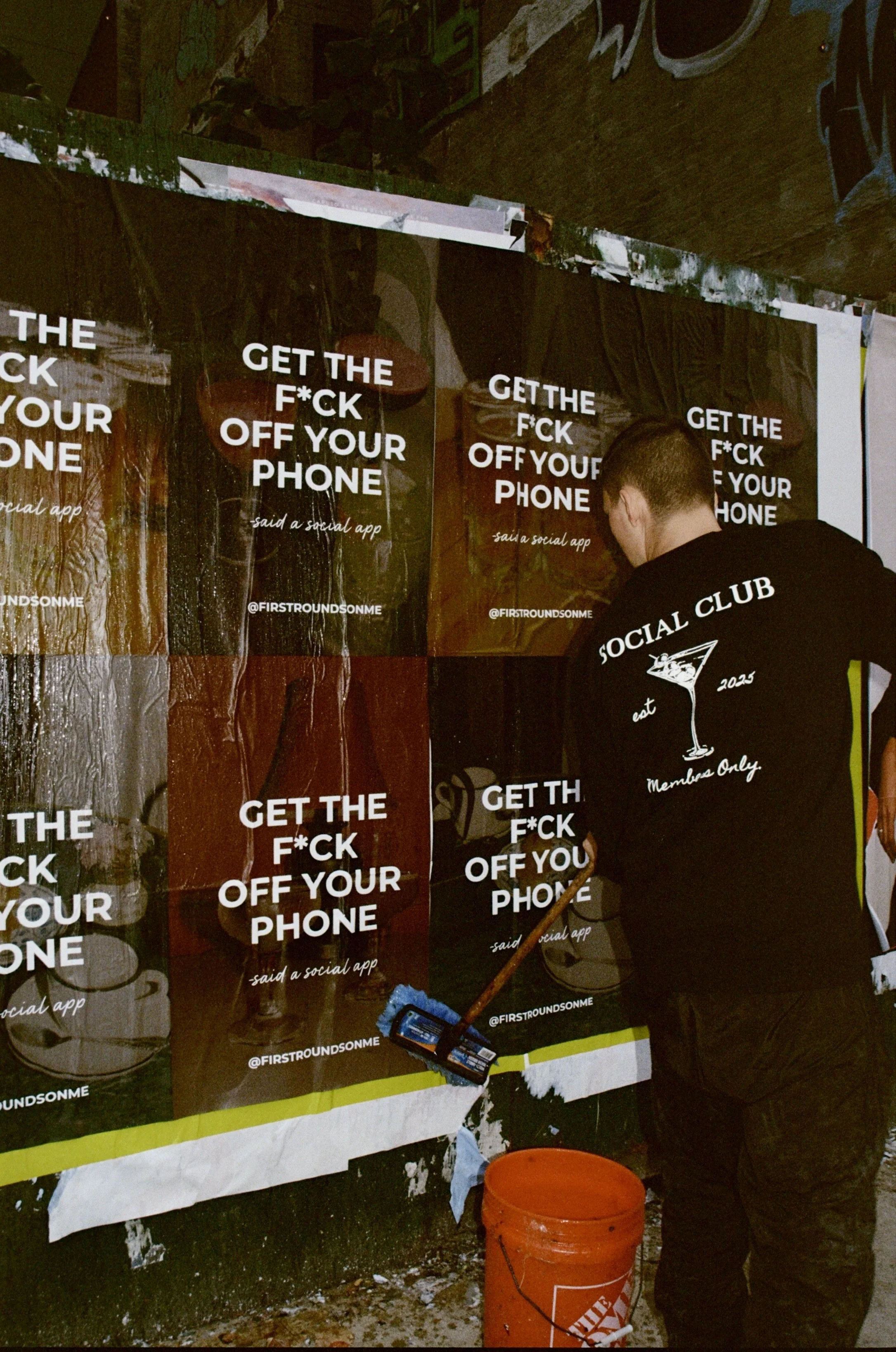
GET THE F*CK OFF YOUR PHONE Campaign
Creative Direction · Campaign Concept · Script · Guerrilla + Experiential Strategy
Watch campaign video here.
When First Round’s On Me pivoted from a dating app into an approval-based social app designed to get people off their phones and into real-life plans, the launch couldn’t feel like a tech update.
It needed to feel like tension.
The insight:
New Yorkers are hyper-connected and deeply disconnected at the same time.
We introduced the campaign with a bold, confrontational line:
GET THE F*CK OFF YOUR PHONE, said a social app.
The Street
We developed a wheatpasting campaign across downtown Manhattan, layering posters in nightlife corridors and cultural hotspots. The visual system paired intimate bar and café imagery — beers, cocktails, coffee tables, dim lamps, imperfect moments — with stark, unapologetic typography.
The contrast was intentional.
Warm, analog environments.
Cold, direct messaging.
It felt less like an ad and more like a cultural statement. Almost like the city was talking back to itself.
The Experience
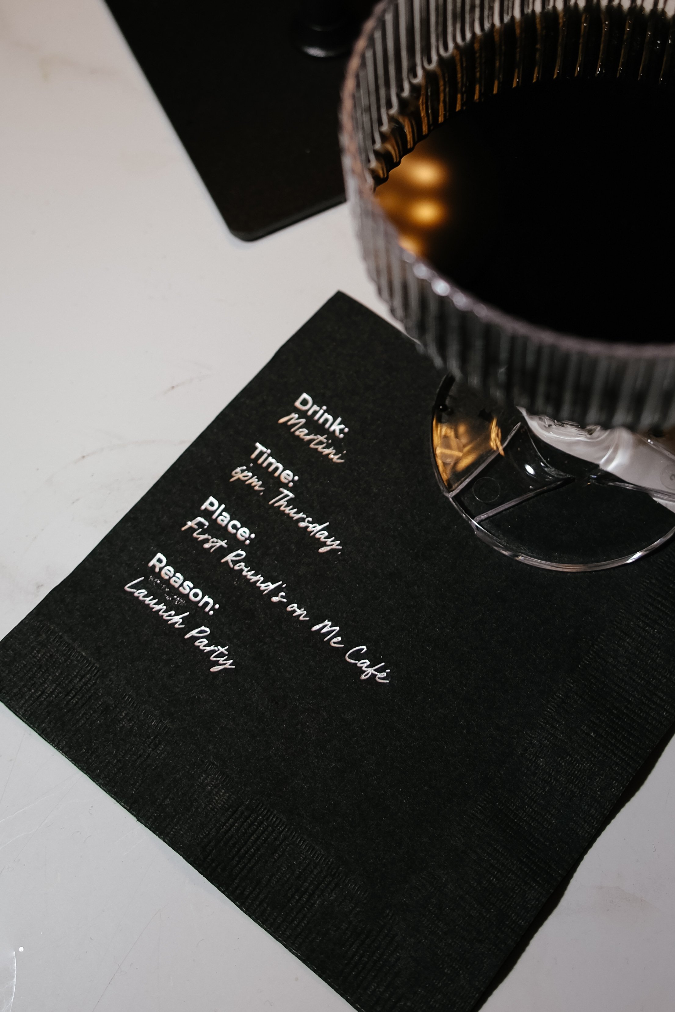
To make the message real, we hosted a No-Phone Launch Party.
Every guest locked their phone in a pouch at the door.
No scrolling.
No photos.
No digital safety net.
Instead, we created social prompts and rules designed to encourage presence and interaction. The brand promise became physical behavior.
The app rewards members with complimentary rounds at curated NYC bars and cafés. But the campaign wasn’t about free drinks.
It was about accountability.
Show up.
Be present.
Make the plan real.
Built in New York.
For people tired of “we should.”
The No-Phone Launch Party
The No-Phone Launch Party
Brand Strategy · Creative Direction · Experiential Design · Full Production
Objective
Reposition First Rounds On Me from a dating app into an approval-based social platform designed to reward real-life plans at curated NYC bars and cafés.
The launch needed to do one thing clearly:
Prove that we are serious about getting people off their phones.
Core Insight
New Yorkers don’t need more ways to connect digitally.
They need fewer distractions and more presence.
If the brand promise is real-world connection, the launch couldn’t just suggest it.
It had to enforce it.
Strategic Move
We turned the campaign line
“Get the F*ck Off Your Phone”
into a physical rule.
Every guest locked their phone in a Yondr pouch upon entry.
No scrolling.
No photos.
No texting.
The absence of phones wasn’t a gimmick.
It was the product in action.
Art Direction
The visual world was elevated and restrained.
Palette: Black + silver
Mood: Cinematic, downtown, intimate
Energy: Classic New York nostalgia, reinterpreted
To counterbalance the tension of phone removal, we layered analog comfort:
• Vinyl DJ spinning early 2000s hits
• Live saxophonist weaving through the crowd
• Classic cocktails: Manhattans, Cosmopolitans, Dirty Martinis
• Tiny passed hot dogs
• Build-your-own BonBon candy bags
It felt timeless. Tactile. Slightly romantic.
Behavioral Design
Without phones, we had to intentionally design connection.
We created social scaffolding:
• “Find a Guest” Bingo
• “Find the Excuses” word search (a playful nod to flake culture)
• Rule cards encouraging guests to talk to strangers
• Drink-buying prompts
To replace digital documentation:
• Disposable cameras were handed to guests
• A live sketch artist created hand-drawn portraits
Moments were captured imperfectly.
Memory over immediacy.
The sketch portraits required stillness and eye contact — reinforcing presence in a subtle but powerful way.
Takeaway Strategy
We also designed physical artifacts guests could take home.
Custom matchboxes read:
“They wouldn’t let me take pictures, so I stole this matchbox instead.”
The line turned restriction into humor.
It extended the campaign voice into something tangible and collectible.
Instead of leaving with content, guests left with objects — proof they were there.
Marketing Impact
The event functioned as:
• A live demonstration of the rebrand
• A word-of-mouth engine rooted in intrigue
• A delayed content strategy via disposable photo development
• A cohesive extension of the wheatpasted street campaign
We didn’t manufacture FOMO.
We manufactured memory.
My Role
I led the entire concept and execution:
• Rebrand launch alignment
• Experiential strategy
• Creative direction
• Full production management
• Activation design
• Vendor coordination
• Cocktail and food curation
• Sketch artist booking
• Floral design
This wasn’t an event layered onto a campaign.
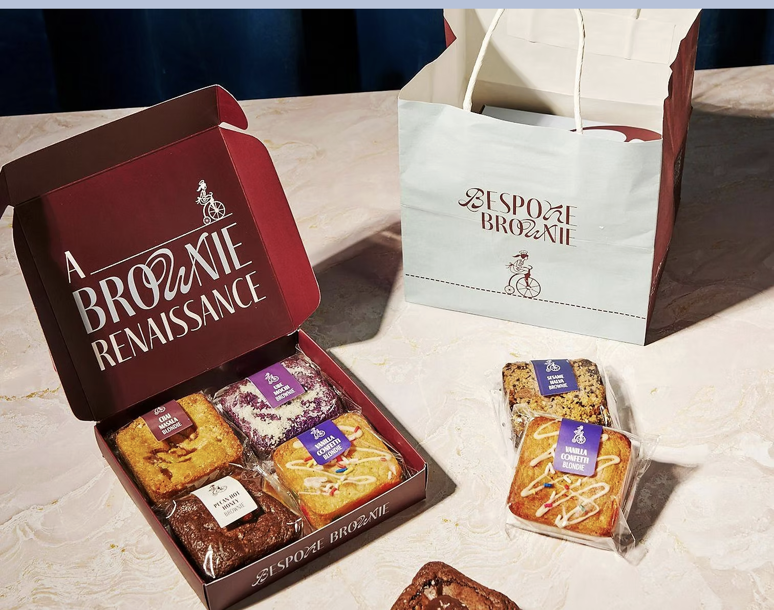
Bespoke Brownies
BESPOKE BROWNIES
Brand Strategy · Marketing Strategy · Concept Development · Go-To-Market
Watch launch campaign video here.
During my time at Orbital Kitchens, I was tasked with creating a new dessert brand to drive incremental revenue across delivery platforms.
I led the project end to end, from market research and product development to brand strategy, marketing, and launch.
Strategic Insight
The New York dessert market is highly saturated but deeply segmented.
Cookies, cinnamon rolls, and niche dessert concepts dominate the space, each owning a clear category. Through internal data analysis, we identified that our highest-performing dessert item was our signature brownie.
At the same time, no brand in New York was truly owning or elevating the brownie category.
The Opportunity
Build a brand that turns brownies into a premium, flavor-driven category.
Not just better brownies, but a concept designed to disrupt the space with both classic perfection and unexpected flavors.
Research & Development
To validate the concept, I led:
• Market analysis across NYC dessert trends and competitors
• Internal performance analysis across delivery platforms
• Focus groups with target customers
• Product testing across 30+ dessert offerings in New York
• Iterative recipe development and A/B testing
The Brand
Bespoke Brownies was designed to feel elevated, indulgent, and slightly unconventional, bringing new energy into a traditionally overlooked category.
Marketing & Launch
I led the full marketing strategy and go-to-market execution.
This included:
• Brand positioning and messaging
• Influencer launch event to introduce the brand to key tastemakers
• A public Galentine’s event with over 250 attendees to drive awareness and trial
• Content, partnerships, and distribution strategy across delivery platforms
Impact
The launch of Bespoke Brownies generated over $1M in incremental revenue within 6 months on delivery platforms alone.
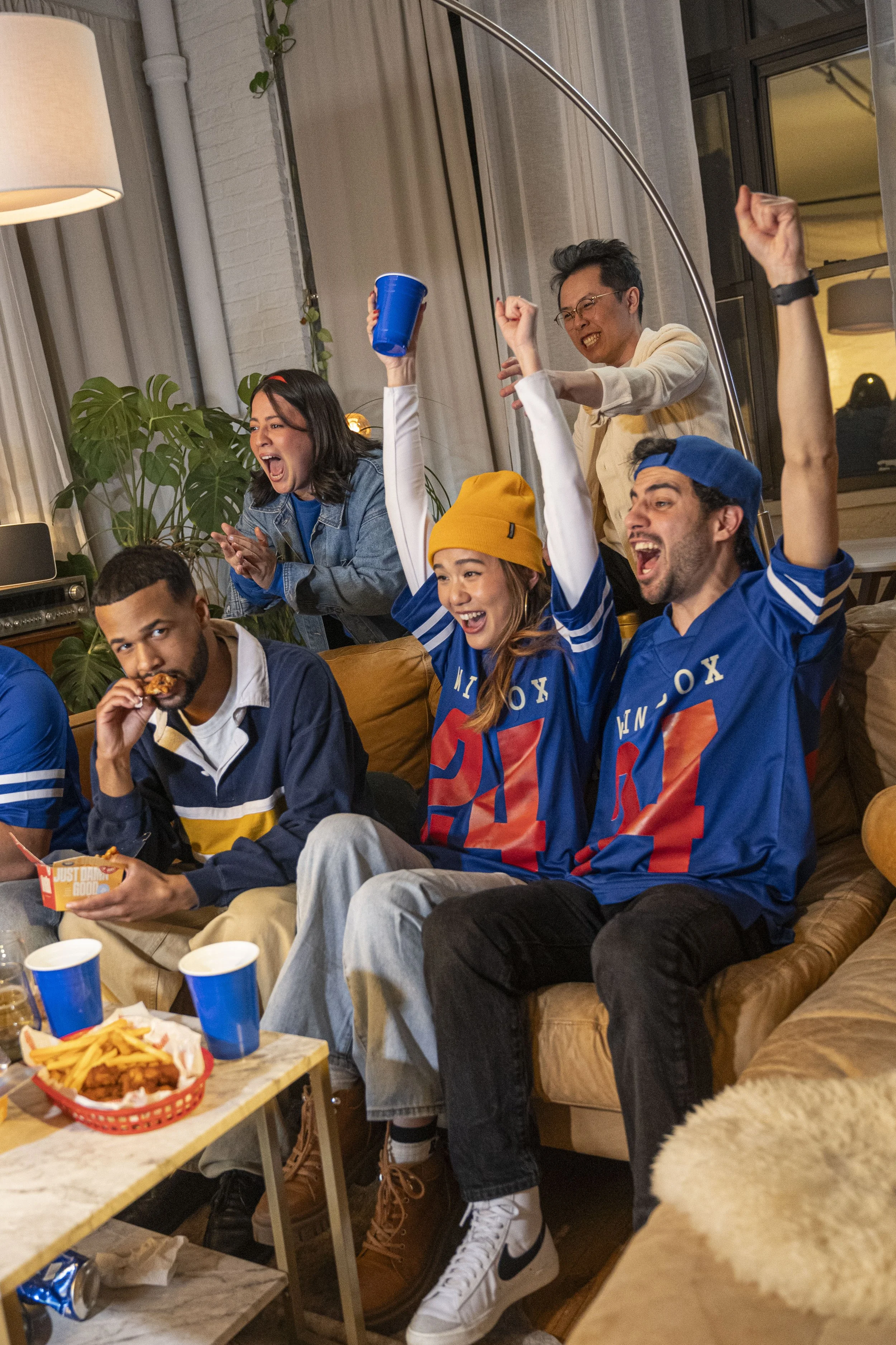
WingBox
WINGBOX
Brand Strategy · Marketing Strategy · Concept Development · Go-To-Market
Watch launch video here.
“Game Changing Moments. Game Changing Wings.”
Wingbox was created with a clear objective:
Maximize sales during the highest-grossing delivery moment of the year and break internal records.
Strategic Insight
Wings are a cultural staple of major American sports moments, especially the Super Bowl.
Demand spikes significantly, but most brands compete on price and volume rather than positioning.
The Opportunity
Build a brand designed to win the moment.
Wingbox was positioned as classic, bold, and unapologetically American, rooted in sports culture, indulgence, and group ordering behavior.
The campaign line “Game Changing Moments. Game Changing Wings.” connected the product directly to the energy and importance of game day.
The Strategy
I led the brand and marketing strategy end to end, creating a concept optimized for scale, speed, and high-demand performance.
Instead of adapting an existing brand, we launched a focused concept built to dominate peak ordering windows.
Marketing Execution
We deployed a full-funnel campaign across physical, digital, and platform channels:
• Wheatpasting campaign across NYC to build awareness in high-traffic areas
• Flyers inserted into all delivery orders to convert existing customers
• Paid social campaign leading into peak game-day demand
• Platform strategy and promotions across Uber Eats and Grubhub
• In-app visibility and offer optimization to maximize conversion
The campaign was designed to meet customers wherever they were, from the street to the app.
Impact
• Over 1,000,000 wings sold
• More than 2x the sales of our original wing brand
• Contributed to breaking company-wide sales records during peak delivery periods
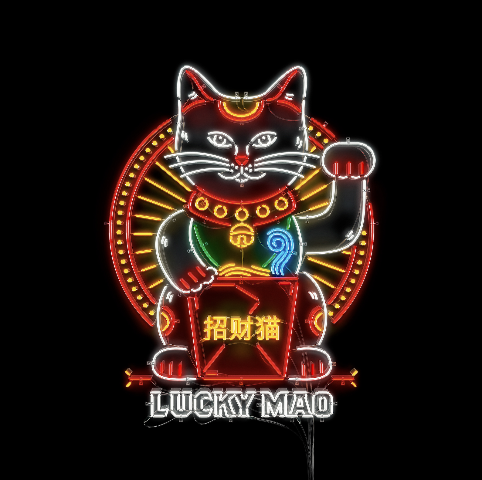
Lucky Māo
LUCKY MĀO
Brand Strategy · Creative Direction · Identity Design · Go-To-Market
Watch Launch video here.
“Where Fortune Meets Flavor.”
Lucky Māo was created to launch a new cuisine category within Orbital Kitchens.
Chinese takeout is one of the most iconic and high-demand delivery categories, but it is often dominated by traditional, interchangeable brands with little differentiation.
The opportunity was clear:
Create a delivery-first Chinese takeout brand that feels modern, memorable, and culturally relevant.
The Vision
We set out to build a brand that stood apart from the sea of generic takeout options.
Modern. Edgy. Distinct.
A brand that felt as intentional as a restaurant, even if it only existed through delivery.
I led the concept end to end, developing the brand strategy, identity, logo, and overall creative direction.
The Strategy
With an extremely limited marketing budget, we focused on what we could control:
The experience.
Every touchpoint, from packaging to messaging to digital presence, was designed to make the brand feel intentional and memorable.
We developed a launch campaign supported by a small paid media effort that drove customers directly to our ordering platform, prioritizing owned channels over third-party reliance.
Brand & Creative
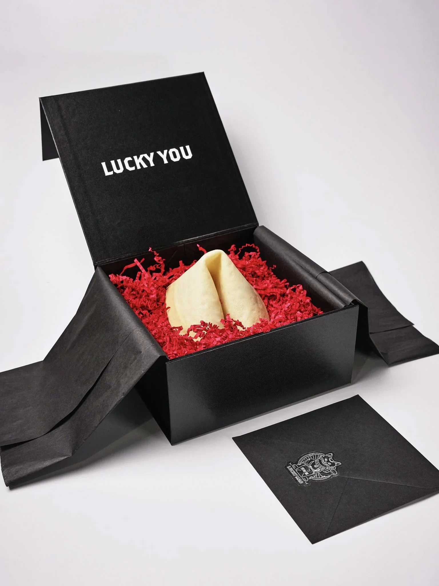
The brand was anchored by the line:
“Where Fortune Meets Flavor.”
We brought this idea to life through custom fortune cookies included in orders, where customers could win real prizes.
This turned a familiar cultural element into an interactive brand experience and created surprise-and-delight moments tied directly to the product.
Marketing & Growth
We built a scrappy, high-impact strategy to drive awareness and trial:
• Pop-ups across NYC food markets to bring a delivery-only brand into the physical world
• Partnerships with Chinese cultural events and festivals
• Small video campaign with three NYC foodie influencers
• Content and ads across Uber Eats, Grubhub, and DoorDash
• Custom merch and packaging inserts included in orders
• Focus groups with customers to continuously refine the product and experience
Every initiative was designed to extend the brand beyond the screen and into real-life interaction.
Launch Moment
To anchor the brand culturally, we hosted an intimate launch dinner for 40 curated NYC foodies, artists, and top customers, transforming an apartment into a one-night-only restaurant.
Impact
• Top 10 performing brand within Orbital Kitchens
• $1.8M in revenue generated
• Successfully differentiated within one of the most saturated delivery categories
Lucky Māo Launch Dinner
Lucky Māo Launch Dinner
Producer · Creative Director · Guest List Strategy
To launch Lucky Māo, Orbital Kitchens’ delivery-only Chinese takeout concept, we transformed a historic New York apartment into a one-night-only fine dining restaurant.
The goal was simple but ambitious: challenge the perception of virtual brands and prove that delivery-first concepts can carry the same cultural and culinary weight as traditional restaurants.
For one night, 40 influential New Yorkers, food writers, artists, tastemakers, and loyal customers, gathered around a multi-course tasting experience hosted by Chef Tommy Lai, the Michelin-trained chef behind Lucky Māo’s menu.
The evening pulled back the curtain on the faces and craftsmanship behind the brand, bringing legitimacy and emotional depth to what is often dismissed as “just takeout.”
We invited 34 curated guests from across the city’s creative and food scenes to experience the brand before the public ever could, turning a digital-first concept into a tangible, immersive moment.
This wasn’t just a dinner.
It was a reframe of what a virtual restaurant could be.
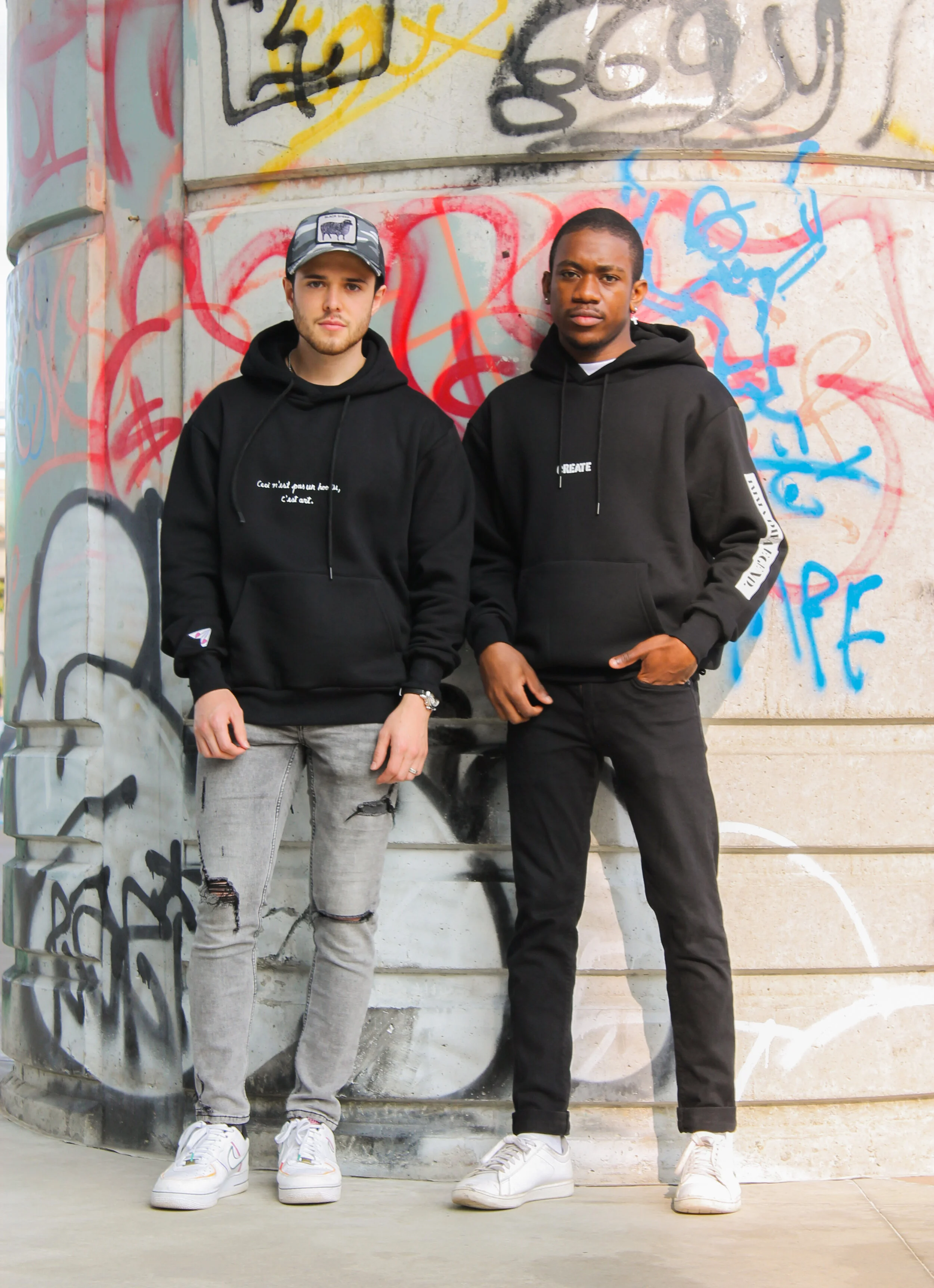
THRIFT FLIPPING ART
THRIFT FLIPPING ART
Designer · Creative Direction · Photography · Content
As part of Vival Garco, I developed a limited-edition collection centered around repurposing thrifted garments into one-of-a-kind wearable art pieces.
The concept was rooted in transformation.
Taking overlooked, discarded clothing and reimagining it into something intentional, expressive, and new.
The Process
Each piece was created by combining thrifted fabrics with unexpected, everyday materials, turning common household items into design elements.
The goal was to blur the line between fashion and art, where every garment felt like a unique, collectible piece.
The Execution
I led the project end to end, including:
• Concept development and design
• Creative direction of the collection
• Photography and visual storytelling
• Production of each one-of-one piece
• Creation of a 6-part video series documenting the process and bringing my community into the making of the collection
Launch & Impact
The collection was released as a limited drop and debuted through a pop-up in collaboration with Infra Boston.
All pieces sold out during the event.
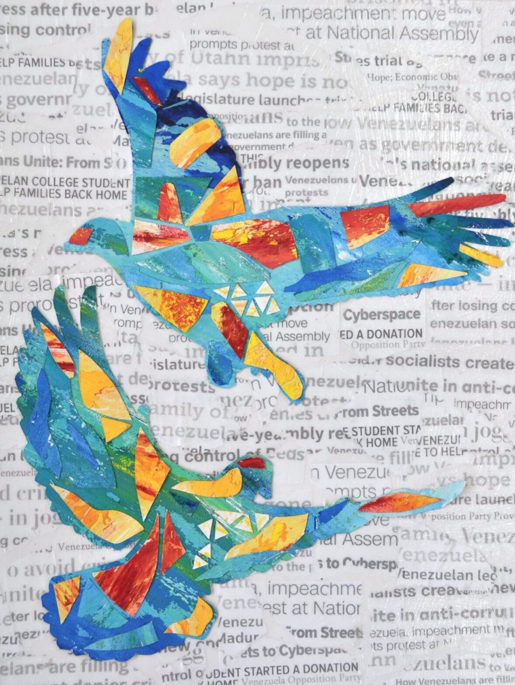
F A U N A
Photographer · Creative Director · Designer
A visual exploration of identity, culture, and symbolism through the lens of Venezuela’s national elements.
The araguaney, the turpial, and the orchid are recognized as Venezuela’s natural symbols, representing the country’s richness in flora and fauna and its vibrant cultural identity .
The Concept
This project was inspired by the beauty and symbolism of Venezuela’s natural world.
I wanted to translate these elements into a visual language that felt both intimate and expressive, capturing not just their physical beauty, but what they represent: color, resilience, and identity.
The Execution
I led the project end to end, including:
• Creative direction and concept development
• Photography and visual composition
• Styling and art direction
• Design for Raíz, Emerson College’s Latin American magazine
The goal was to create imagery that felt editorial, intentional, and emotionally grounded.
The Approach
The composition focused on contrast and symbolism:
Softness and strength
Color and shadow
Nature and identity
Each image was designed to feel like a portrait, not just of nature, but of culture.
Reflection
This project reflects my creative eye and my foundation in art and storytelling.
It represents the side of my work that is driven purely by expression, where visual language becomes a way to explore identity, memory, and meaning.
VIVAL GARCO
VIVAL GARCO
Co-Founder · Brand Strategy · Creative Direction · Production
“A Love Letter to Art.”
Vival Garco was a brand I co-founded in 2019 as part of my capstone project after completing the entrepreneurship program at Emerson College.
The concept was to create handmade, custom hoodies inspired by art history, blending fashion with education in a way that felt personal, modern, and accessible.
The Vision
We set out to build more than apparel.
Each piece was designed as a wearable expression of art, paired with storytelling that educated customers on the inspiration behind each design.
The goal was to make art tangible and part of everyday life.
Building the Brand
I led the brand end to end, building everything from scratch with no funding.
This included:
• Designing and developing the website and Instagram
• Creating the brand identity, packaging, and storytelling
• Developing custom hoodies from scratch with manufacturers in China to ensure quality and fit
• Leading the launch campaign and go-to-market strategy
• Producing pop-ups and experiential moments to bring the brand into the real world
Every touchpoint was intentional and built to create a cohesive brand experience.
Launch & Impact
We launched through a direct-to-consumer model with limited drops and organic demand.
The collection sold out within two months.
What It Taught Me
Vival Garco taught me how to build a brand from zero.
How to create demand without budget.
How to connect product, story, and experience.
And how to turn a creative idea into something people are willing to buy.
It’s where I learned to think not just as a creative, but as a builder.
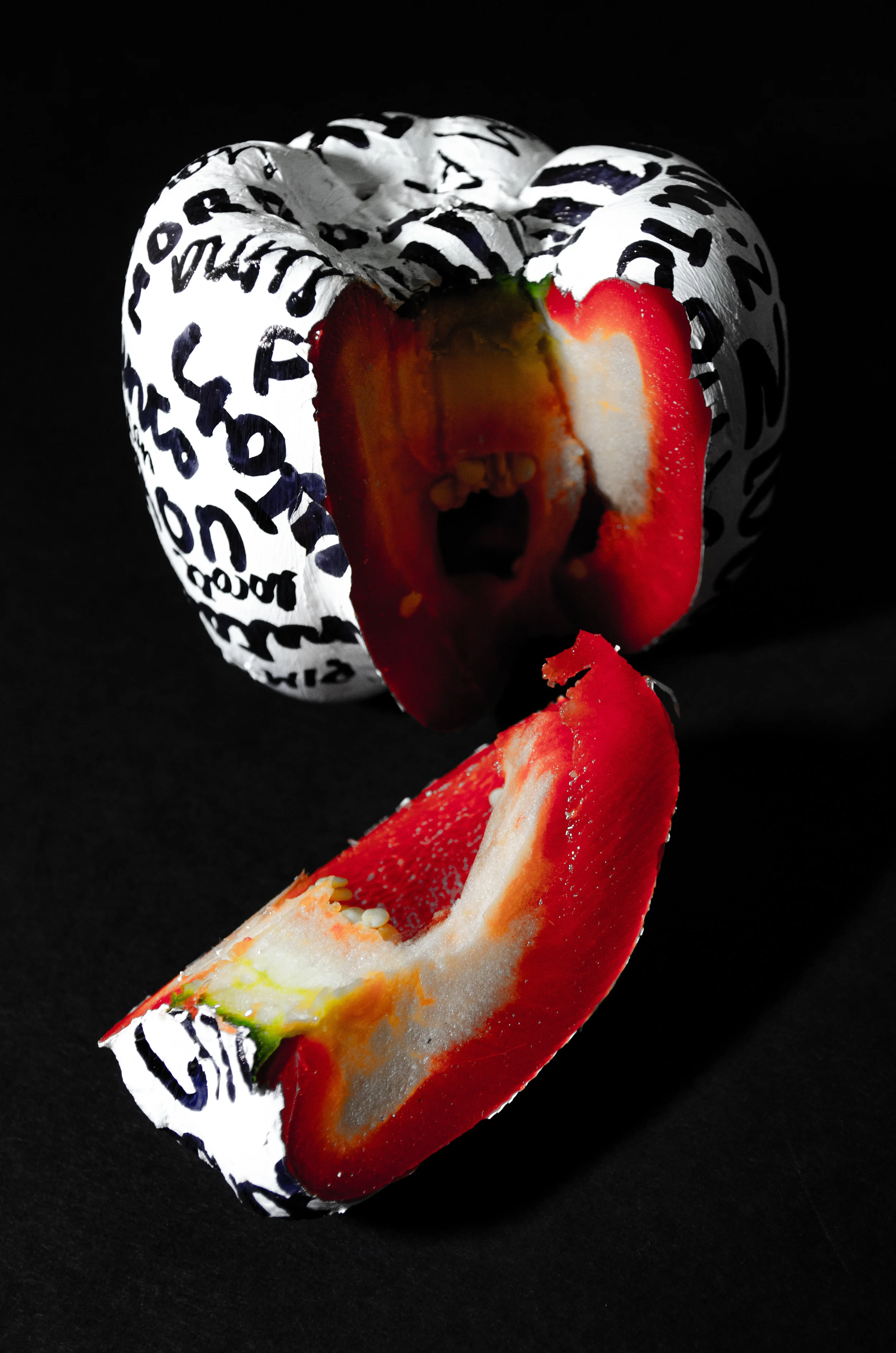
FRUITeria
FRUITeria
Photographer · Creative Direction · Design
A visual study on language, identity, and cultural diversity across Latin America.
Created for Raíz, Emerson College’s Latin American magazine.
The Concept
Latin America shares a language, but not always the same words.
A single fruit can have many names depending on the country, each one carrying its own cultural nuance and identity.
This project explores that diversity through something simple and universal: fruit.
The Execution
I created a series of minimal, still-life photographs, focusing on fruits as the central subject.
Each image was then painted over and layered with hand-written words representing how that same fruit is named across different Latin American countries.
The result is a visual contrast between:
Simplicity and complexity
Sameness and difference
Object and language
The Approach
The art direction was intentionally minimal to allow the language to take focus.
Clean compositions. Soft lighting. Controlled color.
The painted typography introduced an imperfect, human element, reinforcing the idea that language is lived, not standardized.
Reflection
This project highlights my interest in storytelling through visuals and my connection to Latin American culture.
It reflects how design and photography can be used to communicate identity in subtle but meaningful ways.
VIDEO
Art, a Medium to represent the Venezuelan Crisis
ART AS A MEDIUM TO REPRESENT THE VENEZUELAN CRISIS
Mixed Media · Creative Direction · Concept Development
A visual exploration of the Venezuelan crisis through mixed media.
The Concept
This project was created as a response to the ongoing crisis in Venezuela, a country deeply affected by hyperinflation, food and medicine shortages, political unrest, and mass displacement .
Rather than documenting the crisis through traditional reporting, I wanted to translate it into something felt.
Something human.
The Work
Through a series of mixed media pieces, I explored the emotional and physical realities Venezuelans face daily.
Each piece combines:
• Painting
• Drawing
• Collage
• Crayon melting
• Digital manipulation
The backgrounds incorporate real headlines and excerpts from published articles, grounding the work in reality while layering it with emotion and interpretation.
The Tension
The work reflects a contradiction that is difficult to explain but deeply understood by Venezuelans:
Despair and patriotism existing at the same time.
A country facing extreme hardship, yet still loved fiercely by its people.
While news headlines focus on crisis, statistics, and collapse, they often fail to capture this emotional duality.
Reflection
This project is deeply personal.
The crisis has affected my family, my friends, and my identity. It is not distant, it is lived.
Through this work, I wanted to give form to experiences that are often reduced to numbers and headlines.
To show that behind every statistic, there is emotion, memory, and pride.
I will always be proud to call myself Venezuelan.
And if I can use art as a way to speak for my country, there is no other story I would rather tell.